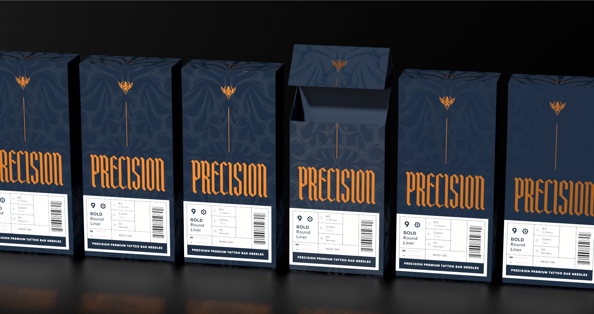
Precision is an established tattoo supply brand with deep roots in the industry, but its visual identity and packaging had become dated and increasingly difficult to navigate. Without a dedicated website or social media presence, the brand is experienced primarily through its products, which are distributed by tattoo suppliers throughout the United States and internationally. This made the packaging itself an especially important brand touchpoint. The goal of the refresh was to modernize Precision while respecting its history and existing recognition within the tattoo industry.
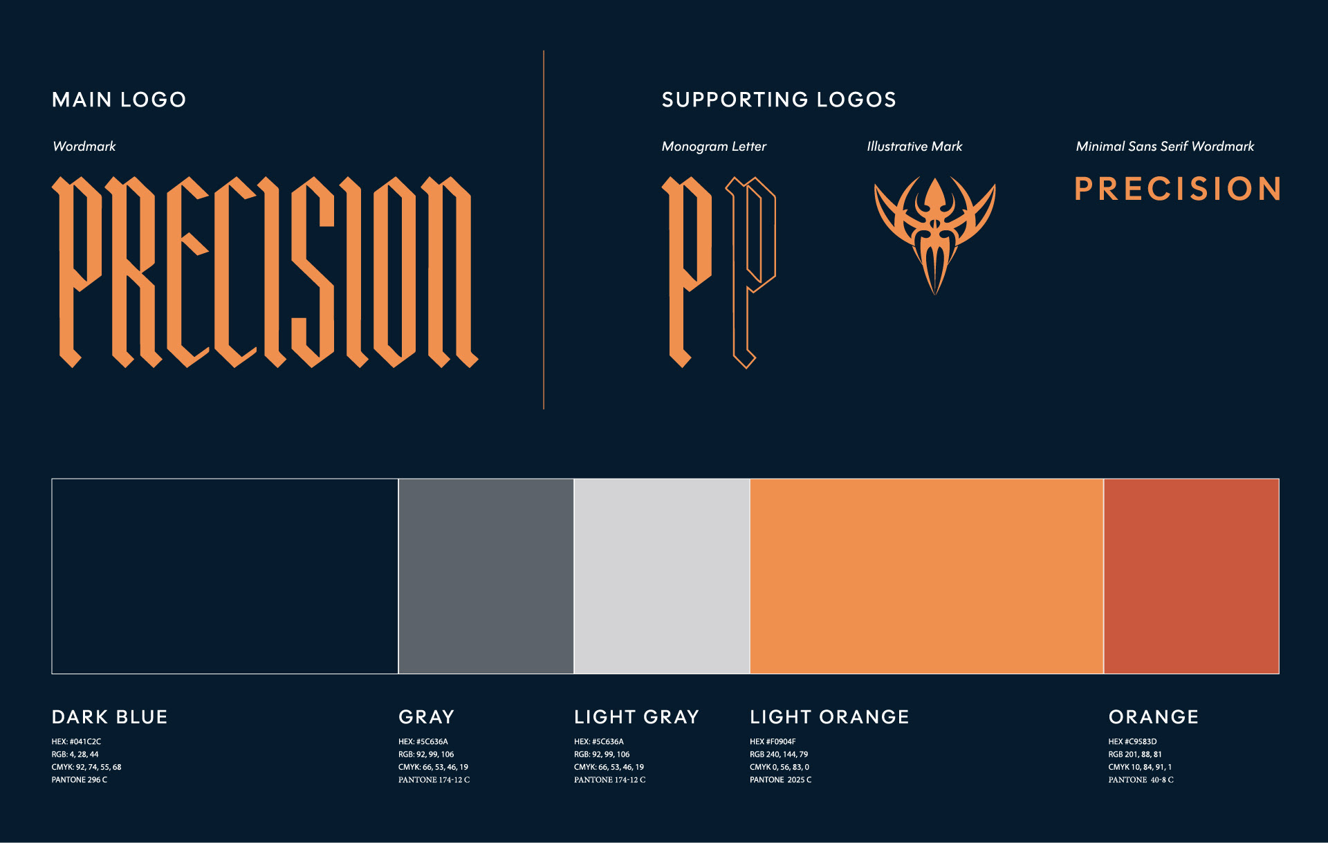
The refreshed identity centers around a bold new wordmark that draws inspiration from the blackletter influences of the original brand while creating a cleaner, more distinctive visual presence. The brand’s existing icon, previously its primary identifier, was retained as a tertiary mark—preserving a connection to Precision’s history without allowing it to dominate the new system.
That original mark also helped inspire a subtle cyber sigilism texture that appears as a spot gloss across the packaging. The treatment creates a connection between the brand’s heritage, tattoo culture, and contemporary visual trends while adding depth and tactility without competing with the functional information on the package.
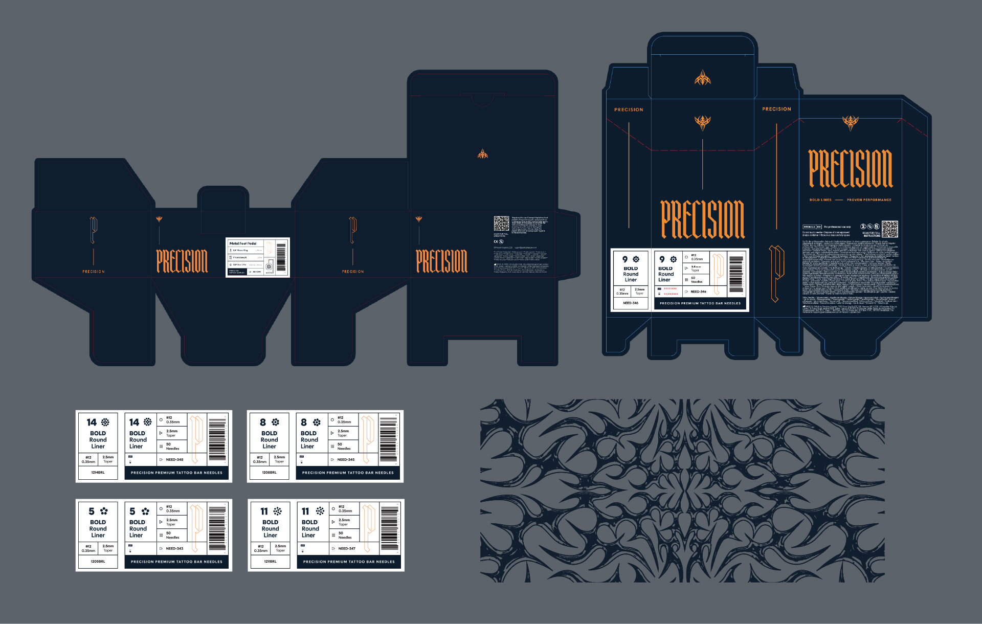
A major focus of the redesign was the packaging label system. Tattoo artists work with a wide range of needle configurations, sizes, and tools, making clear and immediate product identification essential. I developed a bold, utilitarian labeling system that prioritizes the information artists need most and presents it in a way that can be quickly scanned and understood.
Developing the system required research into both information hierarchy and how the products are actually stored and accessed in a working tattoo environment. This helped determine not only which information needed the greatest visual emphasis, but where that information should appear on the package so it remains visible when products are organized together.
The result is a more cohesive and contemporary identity that balances the personality of the Precision brand with the practical demands of the artists who use its products.